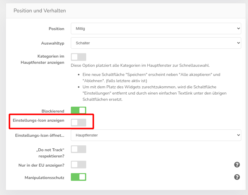
The settings icon at the bottom left bothers me, can I change/remove it?
The so-called settings icon is activated by default in our design templates, but can easily be switched off. To do this, go to the theme-administration and deactivate the corresponding function for the theme you are using:
Further down on the page, you can also replace the icon with your own:
Insert link if deactivated
Legally, you are obliged to offer the user the option of accessing the settings again and making changes at any time. If you remove the icon, you should at least add a text link instead, for example at the bottom of the page, which is displayed on every subpage. You can also find the link to open the banner under the menu item Dashboard & integration. It is a simple link with an anchor:
Clicking on this link opens the configuration pop-up again for the visitor.
If you cannot insert Javascript-links, you can alternatively use the following target in a link: #CCM.openWidget.
